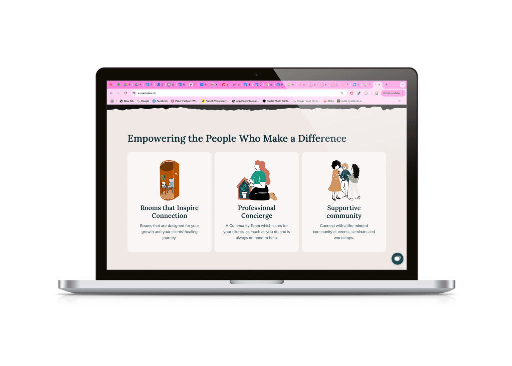
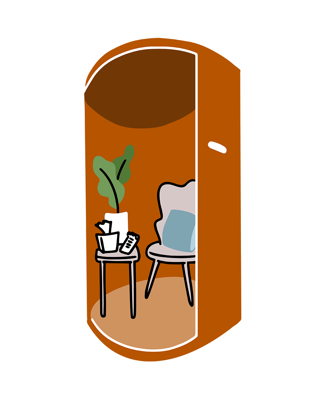
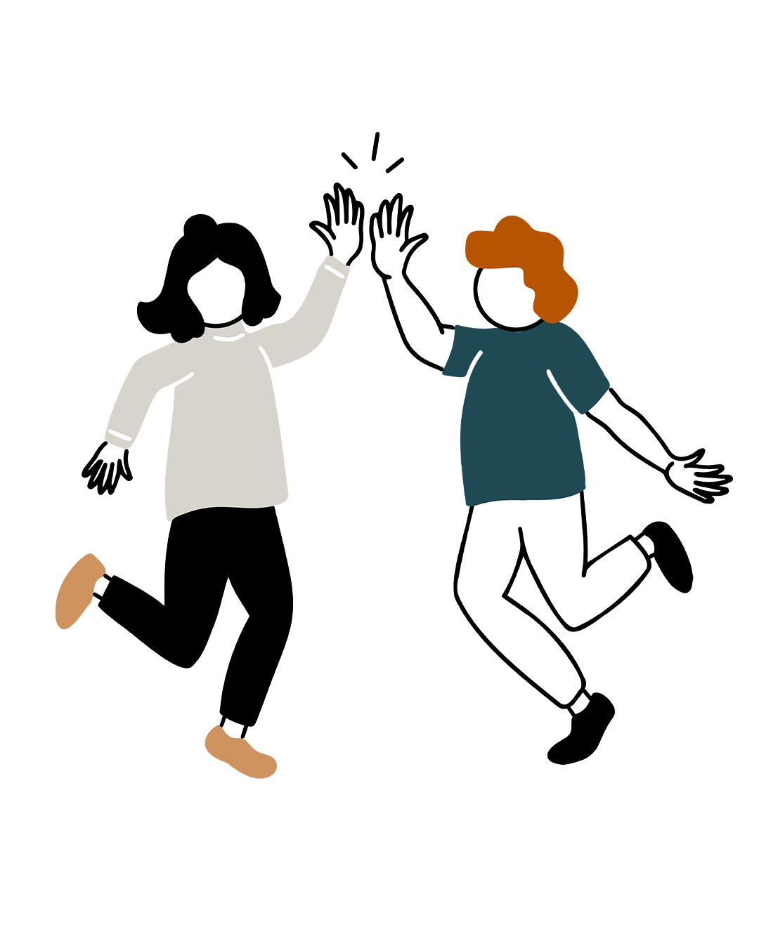
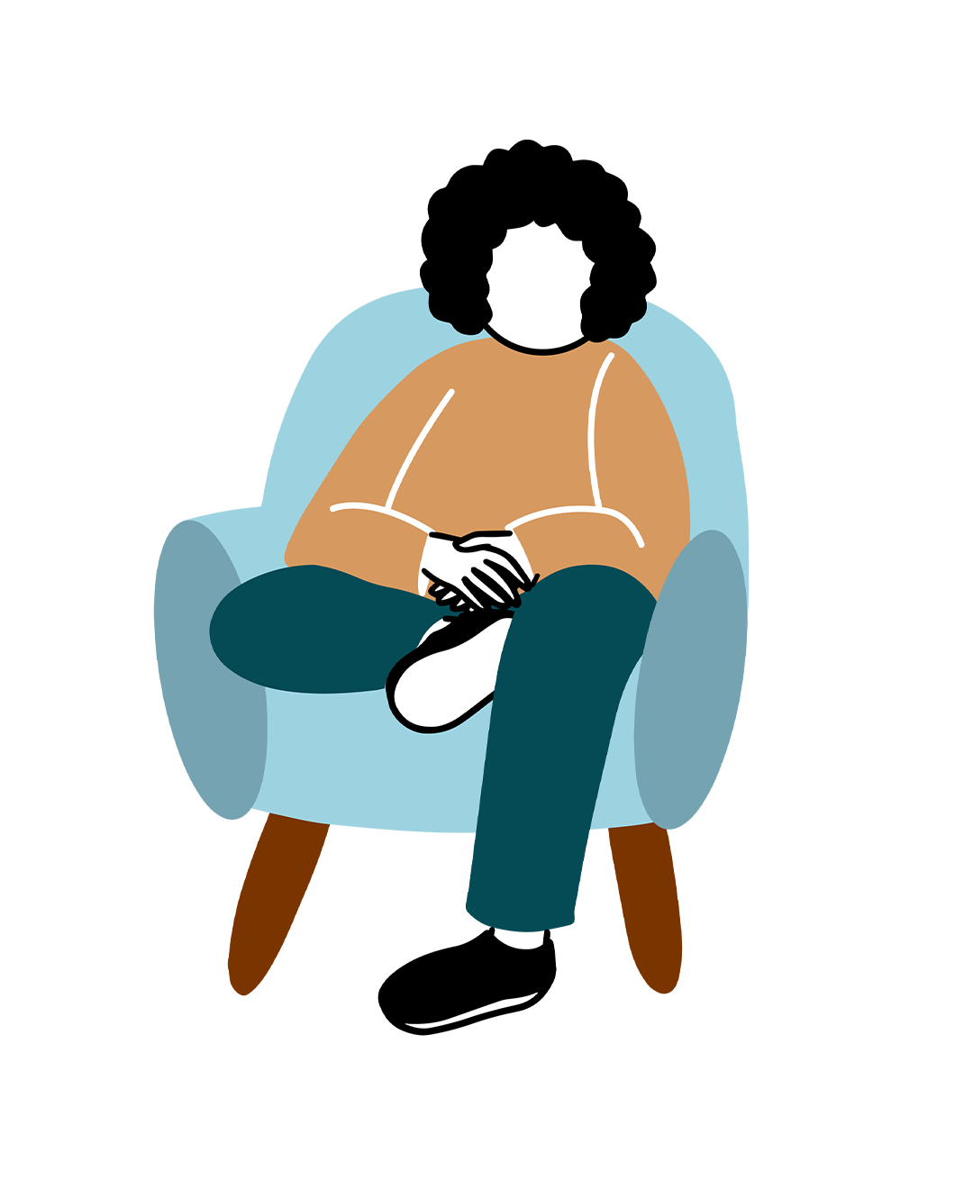
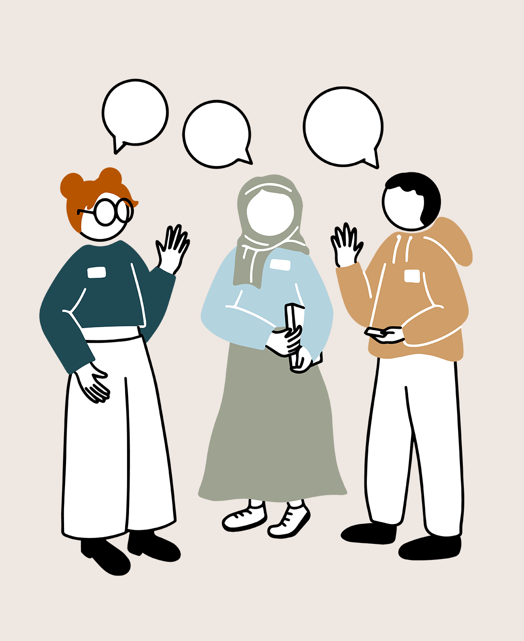
Simple, professional and friendly illustrations
Illustrated with simplicity and readability in mind. Working alongside UX to create inclusive, explanatory visuals to aid understanding and navigation of the website.

The Brief
To create a collection of illustrations in a style that makes therapy feel welcoming while maintaining professionalism. Simplifying topics across the entire website with spot illustrations and icons.
Process
- Working with the founder we developed a visual style, ensuring the balance between approachability and credibility most suited to a therapy service brand
- I concepted, developed and refined illustrations for a range of needs across the site, from home-page images to profile icons
- Final illustrations were then turned into vectors for optimal use for web developers
- Not forgetting to conciously consider representation throughout the illustrations
The Impact
- 45 illustrations, some with multiple use cases across the site
- A coheasive visual identity for brand, website and future app
- Illustrations repurposed for numerous marketing channels, email, social, blog etc…
- Most importantly, a website that makes the brand feel trustworthy!
My Favourite Part
Getting to take on the challenge of creating illustrations that are fun and inviting whilst keeping them professional too. I feel the brand colour pallete aided the professional tone, whilst the rounded and flat style illustration conveys the sentiment that the company is friendly and approachable


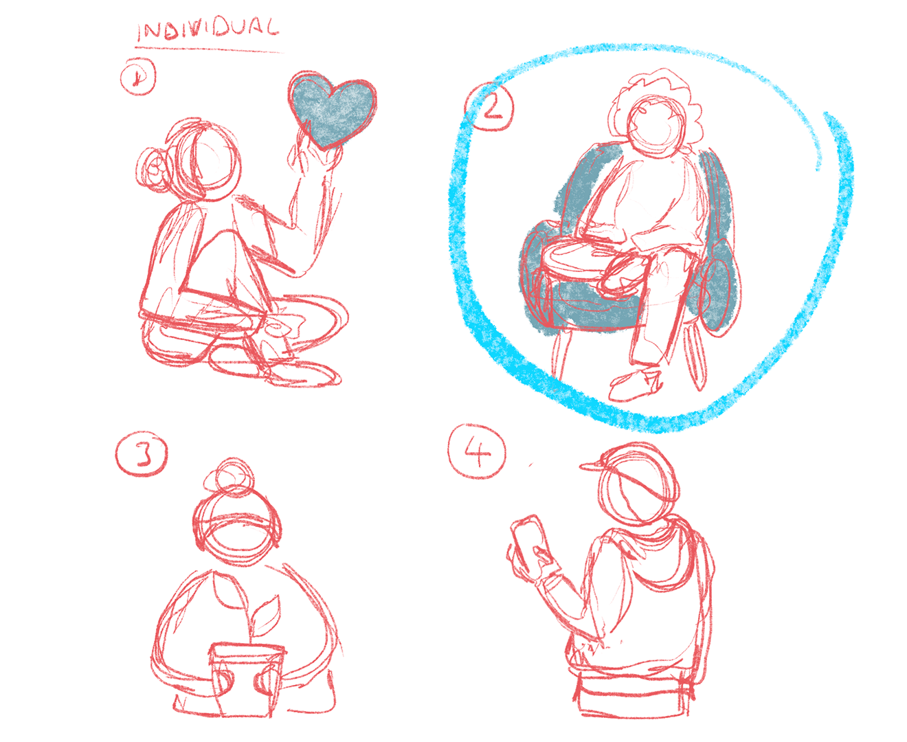
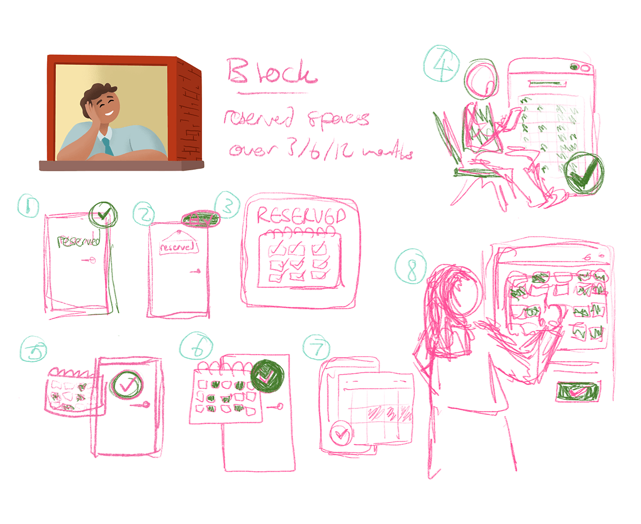
Extra behind-the-scenes workings…
Concept sketches and development